Having taken a look in our last two blog posts at the various accounts receivables and individual customers, we will now look at some simple statistics, examine the correlation between certain parameters and view the results as Excel charts.
If you missed the last two blog posts, you can access them by clicking on the following links:
Do customers always pay on time?
Between payment and morality: How fast do your customers pay?
Is there a connection between the frequency of business activities and payment behavior?
The first question we want to examine is the relationship between the number of business transactions with a company (number of documents for a customer) and the average time in days until the company pays the receivable. Or, to put it even more simply: Does a company pay faster if I do a lot of business with it?
To answer this question, we first need some data. And the easiest way to do this is to use SQL statements. In this case, we could also consider doing a direct Excel export from SAP, since only the BKPF (document header) and BSEG (document segment) tables have to be addressed. However, the results would have to be processed and aggregated, then further calculations would have to be carried out directly in Excel. This is a very cumbersome process and also one that can take a lot of time, depending on the SAP system and the size of the tables mentioned. If you do not have access to SQL, use the SQVI transaction and connect the BKPF and BSEG tables with a table join using BUKRS, BELNR, and GJAHR, if SAP has not already done this for you.

Once we have successfully executed the SQL statement, we obtain a relatively large table containing the following fields: KUNNR, Number of Documents (DOCUMENTS), Average (AVG_CLEARING), Minimum (MIN_CLEARING) and Maximum (MAX_CLEARING) time of clearing a receivable. To be able to carry out a more comprehensive analysis, the STDEV_CLEARING and TOTAL_CLEARED_RECEIVABLES columns are also added. These show the fluctuations in the values for the average clearing durations (STDEV_CLEARING) and the total sum of cleared receivables.
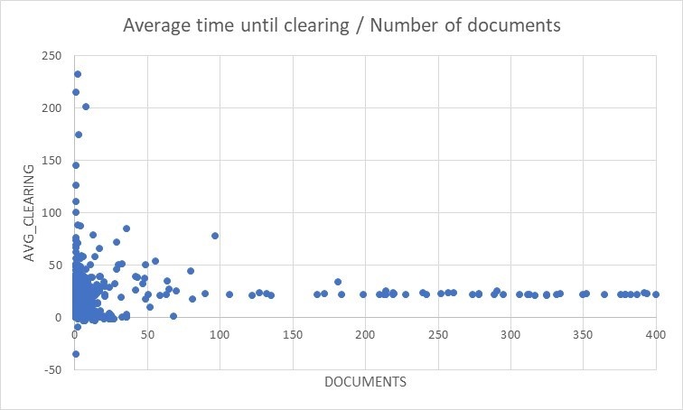
In order to check the relationship between the frequency of business activities and payment behavior, we first need to determine the number of documents (DOCUMENTS) and the average time taken to settle a receivable (AVG_CLEARING). First, however, we have to export the results of the SQL statement as a table to Excel, and subdivide them into columns according to data. We then select the DOCUMENTS and AVG_CLEARING columns and create a chart using Insert – Charts – Scatter (XY). The documents are grouped by customer number, so that the number of documents is always specified for a customer.
The result will look something like this:

On the left side of the graph (with less than 50 documents), we see all the customers with whom we have made only a few transactions. The spread is quite large in this area and ranges from -43 days to more than 200 days. If we take a look to the right of the 50 documents, we find that the more business we do with our customers, the more consistent the average duration of clearing is, standing at around 20-23 days.
On the basis of this knowledge, we can thus state that customers with whom we do business frequently tend to pay their bills very reliably within 20-23 days.
The whole truth about payment behavior
The attentive reader will probably note here that the number of documents in relation to the average duration of clearing is actually only half the truth. The average does not tell us anything about the degree of distribution. It is therefore quite possible that a customer may always pay its invoices on average within a limit of e. g. 30 days, which could be the general company limit for payment. However, payment behavior is very strongly scattered around this value. If I don’t pay today, I’ll pay tomorrow. Reliability is the keyword in this context.
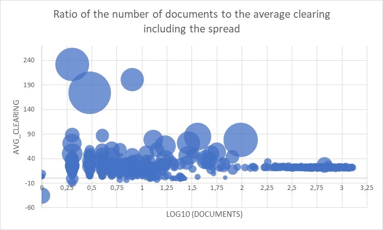
Let’s take a closer look at the column for the standard deviation of the average clearing of a receivable, which we can also obtain with the SQL statement (STDEV_CLEARING). In order to obtain a better scale for the number of documents, we first calculate the logarithm (LOG) to base 10, in this way numbers smaller than 10 are represented with a 0 and corresponding decimal places, two-digit numbers with 1 and decimal places, three-digit numbers to 2 and decimal places, and so on. This type of transformation is particularly suitable for displaying the relationships that we will focus on in what follows. This can be done in no time in Excel by entering “=LOG10 (cell)”, so that we can quickly calculate the Log10 for all documents in a new column for all customers. The other values required for the chart are used as indicated. If we now select the columns Log10 (DOCUMENTS), AVG_CLEARING and STDEV_CLEARING and select Insert – Charts – Scatter (XY) – Bubble diagram, we obtain something similar to the following diagram:

On the X-axis you can see the values of the Log10 (DOCUMENTS) which we have calculated before. The Y-axis shows the average duration of clearing and the diameter of the “bubbles” indicates the degree of spread around the average / mean value.
The chart shows a slightly different picture than when solely taking the average duration of clearing in relation to the number of documents into consideration. The explanation for this: The larger the circle in the resulting diagram, the more the clearing of a receivable is scattered around the average duration. Moreover, one-time customers will not taken into consideration in this analysis. The reason for this is as follows: The log10 of one document (Log10 (1) = 0) equals zero. If there is only one document, the distribution is also 0, since there can be no fluctuations around a single value. As a result, customers with a diameter of 0 are not displayed. The same applies to customers for whom there is no spread over the average duration of clearing. However, there is a special case: If a document features several different items, different data can exist for clearing the entire document. This is the case with the three documents on the far left, which are dissected by the Y-axis at their center.
The chart shows a strongly differentiated picture. There are several customers with anomalies. On the one hand, there are customers with whom not many transactions (and thus only a few documents) are processed, and who tend to pay their invoices with large degrees of fluctuation (those in the upper-left corner of the diagram); and, on the other hand, there are customers with a large number of available transactions (documents), where there is only a more moderate fluctuation in payment behavior (lower middle of the diagram). The many smaller circles can probably be ignored to a large extent, as transfers made shortly before the weekend can, for example, lead to slight fluctuations.
Now it’s over to you again. Explore why there are customers for which there are large fluctuations. We don’t necessarily want to go demonizing anyone in particular just yet, but it looks like what is happening here is that these type of customers are literally living “from hand to mouth”, and thus may also pose a certain risk for your company.
Do you also want to know how to create colorful diagrams quickly and easily from your SAP data? Then you can download the guide on how to do so here:

